
Showing posts with label What is design for print. Show all posts
Showing posts with label What is design for print. Show all posts
Tuesday, 22 November 2011

Friday, 18 November 2011
Layout inspiration - Gridness
www.gridness.net
"The grid is one of the most important tools a designer has at his/her disposal. They’ve always been a difficult thing to explain to clients, though luckily, the results speak for themselves. Also luckily, the clean, organized look they impart is en vogue right now, which means better design is becoming “hip,” for lack of a less unsavory term."
This site is a great source of grid and layout inspiration. These are just some of the examples found on their site:


"The grid is one of the most important tools a designer has at his/her disposal. They’ve always been a difficult thing to explain to clients, though luckily, the results speak for themselves. Also luckily, the clean, organized look they impart is en vogue right now, which means better design is becoming “hip,” for lack of a less unsavory term."
This site is a great source of grid and layout inspiration. These are just some of the examples found on their site:


Thursday, 17 November 2011
Wednesday, 19 October 2011
Team Impression - Process is Form
At the end of the print visit with Team, they gave us each a book entitled 'Process is Form'.
This book by Team impression, has been produced to encourage readers to analyse and consider more closely the relationship between the process and mechanics of print production and the practice of design and visual communication. The book is illustrated throughout with combinations of special colours and print techniques along with photographs of industrial objects liberated from their everyday habit.
The hexagonal illustrations are a combination of 1-4 colours, spot UV varnishes and foils. Certain elements of print production such as guillotine blades and wash-up bottles are photographed on plinths to show how print is an art form in itself.


This book by Team impression, has been produced to encourage readers to analyse and consider more closely the relationship between the process and mechanics of print production and the practice of design and visual communication. The book is illustrated throughout with combinations of special colours and print techniques along with photographs of industrial objects liberated from their everyday habit.
The hexagonal illustrations are a combination of 1-4 colours, spot UV varnishes and foils. Certain elements of print production such as guillotine blades and wash-up bottles are photographed on plinths to show how print is an art form in itself.


Monday, 17 October 2011
What is design for print? Proofing & Preflight
Preflight
The term preflight check originates from the aviation industry where it is a standard procedure for pilots to go over a checklist before lift-off. Preflight checks (preflighting) for print documents have a similar idea in mind. They run trough all the files you used in the document to see if they're missing, changed or anything else that might have happened to the file.
Back in the day, preflight programs or plug-ins gathered all used fonts before sending off your document to the printer. With the rise of PDF this process changed as fonts are included fully or in part in the PDF file. A (modern) preflight check checks all used images and fonts in the file, if the files can be found at their indicated locations, if they're in CMYK and if fonts are used and load correct. On occasion copyrighted fonts cause problems with being embedded in the PDF file. This also is checked in the preflight check.
InDesign
Click File > Preflight… in the menu to open the Preflight Check dialog screen. Here you'll find categorized sections to check your documents on errors and missing files. A small warning icon indicates problem areas.


The term preflight check originates from the aviation industry where it is a standard procedure for pilots to go over a checklist before lift-off. Preflight checks (preflighting) for print documents have a similar idea in mind. They run trough all the files you used in the document to see if they're missing, changed or anything else that might have happened to the file.
Back in the day, preflight programs or plug-ins gathered all used fonts before sending off your document to the printer. With the rise of PDF this process changed as fonts are included fully or in part in the PDF file. A (modern) preflight check checks all used images and fonts in the file, if the files can be found at their indicated locations, if they're in CMYK and if fonts are used and load correct. On occasion copyrighted fonts cause problems with being embedded in the PDF file. This also is checked in the preflight check.
InDesign
Click File > Preflight… in the menu to open the Preflight Check dialog screen. Here you'll find categorized sections to check your documents on errors and missing files. A small warning icon indicates problem areas.

If there are any files missing you can replace those from the Preflight Check dialog screen. If - for any reason - you can't send a packaged PDF to your printer, there's also the option to package all external files in one directory to send those separately with your layout document.

However, there are some general proofing issues which preflight does not cover. These include:
- Is the bleed correct? Does the size comply with the printers request.
- Are your color separations correct? No PMS colors mixing with your CMYK or the other way around.
- Are you exporting with the correct registration marks? Check if image resolutions are good enough (300 dpi for standard print work)
- Is the size of the document correct? Are you adding the bleed size to the document size?
Source: printernational.org
What is design for print? Multi-tone
Multi-tone
Duotone is the generic name for multitone printing, which can be done with two, three or four inks. This process requires that the press be set up with special inks, usually PANTONE-designated colors, instead of the standard CMYK inks used for process color printing. Usually the images are printed with a dark base color and a lighter second color, overprinted to fill in, tint and tone the photo or graphic.
Duotone color mode in Photoshop supports between one to four colors of ink. Because home inkjet printers are far better at printing full-color images than black and white, many photographers and designers use Photoshop Duotone processing to improve their artwork/prints. Photoshop's Duotone mode is also commonly used for creating sepia toned prints, using black and yellow inks, sometimes with a third colour.
There are 4 types of multitone images in all. Each one contains the number of inks as the name implies:


Duotone is the generic name for multitone printing, which can be done with two, three or four inks. This process requires that the press be set up with special inks, usually PANTONE-designated colors, instead of the standard CMYK inks used for process color printing. Usually the images are printed with a dark base color and a lighter second color, overprinted to fill in, tint and tone the photo or graphic.
Duotone color mode in Photoshop supports between one to four colors of ink. Because home inkjet printers are far better at printing full-color images than black and white, many photographers and designers use Photoshop Duotone processing to improve their artwork/prints. Photoshop's Duotone mode is also commonly used for creating sepia toned prints, using black and yellow inks, sometimes with a third colour.
There are 4 types of multitone images in all. Each one contains the number of inks as the name implies:
- Monotone grayscale images printed with a single ink
- Duotone grayscale images printed with two inks
- Tritone grayscale images printed with three inks
- Quadtone grayscale images printed with four ink
Source: printernational.org
(Images below are from the Photoshop induction)


What is design for print? Printing processes
(Offset) lithgography
It is the most widely used printing technique on the market, suitable for printing on paper, cardboard, plastic and other flat materials. Offset is used for printing books, newspaper, stationery, packaging, etc. The following video (provided by Lorenzo) explains the offset process in more depth which I have summarised below:
In addition to size, page count, colour coverage and quantity the estimator also evaluates press time, special paper order, labour and shipping costs. This must be done efficiently to get the best price. Each file is inspected carefully to make sure they have all the fonts, colour palettes and high resolution graphics - a sample is then given to the client
The colours are then separated into the four colour process colours or PMS (Pantone) colours. Each colour is then etched into thin, aluminium plates which are then taken to the press to print the job.
The press is comprised of four separate presses, one in each tower. The four plates are then wrapped around a plate cylinder in each of these 'towers'.
There needs to be the right balance of ink and water to keep the non image area, clean. The image is transferred as a reverse image from the plate to a blanket (rubber pad) which is locked tightly around the blanket cylinder. The paper is moved from unit to unit to create the full composite image. The impression cylinder squeezes the paper at just the right pressure to make sure the print is as smooth as possible.
Flexography
In flexography a flexible (typically rubber) printing plate is used, which extends the range of substrates that can be printed on. A positive, mirror image rubber polymer plate on a cylinder, transfers 'sticky ink' directly onto the print surface. It can be used for printing on almost any type of substrate including plastic, cellophane and paper. Examples of products are crisp packets and bottle labels.


Digital print
(definition courtesy of wikipedia) Digital printing refers to methods of printing from a digital based image directly to a variety of media. It usually refers to professional printing where small run jobs from desktop publishing and other digital sources are printed using large format and/or high volume laser or inkjet printers.
Digital printing has a higher cost per page than more traditional offset printing methods but this price is usually offset by the cost saving in avoiding all the technical steps in between needed to make printing plates. It also allows for on demand printing, short turn around, and even a modification of the image (variable data) with each impression. The savings in labor and ever increasing capability of digital presses means digital printing is reaching a point where it will match or supersede offset printing technology's ability to produce larger print runs at a low price
Rotogravure
Gravure is a type of the intaglio printing process that involves engraving the image onto an image carrier. Gravure printing presses two large print reels of paper together rather than sheets of paper. This type of printing is the fastest and widest printing press in operation. It is capable of transferring more ink to the paper than other printing processes, and is also noted for its remarkable density range.
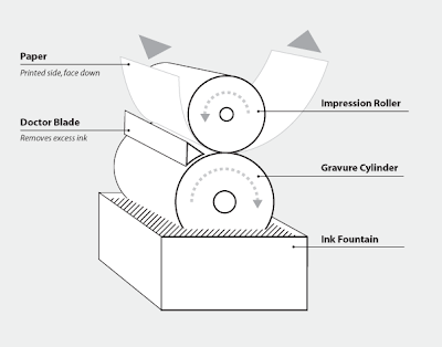
A gravure printing press has one designated printing unit for each color, commonly CMYK. While the press is in operation, the engraved cylinder is partially immersed into the ink fountain, filling the recessed cells. As the cylinder rotates, it draws ink out of the fountain with it. Acting as a squeegee, the doctor blade scrapes the cylinder before it makes contact with the paper removing ink from the non-printing (non-recessed) areas. Next, the paper gets sandwiched between the impression roller and the gravure cylinder. This is where the ink gets transferred from the recessed cells to the paper.
The purpose of the impression roller is to apply force, by pressing the paper onto the gravure cylinder, ensuring maximum coverage of ink. Then the paper goes through a dryer because it must be completely dry before going through the next color unit and absorbing another coat of ink.
Screen print
Screen printing is a printing technique that uses a woven mesh to support an ink-blocking stencil. The attached stencil forms open areas of mesh that transfer ink or other printable materials which can be pressed through the mesh as a sharp-edged image onto a substrate. A roller or squeegee is moved across the screen stencil, forcing or pumping ink past the threads of the woven mesh in the open areas.
Screen printing is also a stencil method of print making in which a design is imposed on a screen of silk or other fine mesh, with blank areas coated with an impermeable substance, and ink is forced through the mesh onto the printing surface. It is also known as silkscreen, serigraphy, and serigraph printing.


It is the most widely used printing technique on the market, suitable for printing on paper, cardboard, plastic and other flat materials. Offset is used for printing books, newspaper, stationery, packaging, etc. The following video (provided by Lorenzo) explains the offset process in more depth which I have summarised below:
In addition to size, page count, colour coverage and quantity the estimator also evaluates press time, special paper order, labour and shipping costs. This must be done efficiently to get the best price. Each file is inspected carefully to make sure they have all the fonts, colour palettes and high resolution graphics - a sample is then given to the client
The colours are then separated into the four colour process colours or PMS (Pantone) colours. Each colour is then etched into thin, aluminium plates which are then taken to the press to print the job.
The press is comprised of four separate presses, one in each tower. The four plates are then wrapped around a plate cylinder in each of these 'towers'.
There needs to be the right balance of ink and water to keep the non image area, clean. The image is transferred as a reverse image from the plate to a blanket (rubber pad) which is locked tightly around the blanket cylinder. The paper is moved from unit to unit to create the full composite image. The impression cylinder squeezes the paper at just the right pressure to make sure the print is as smooth as possible.
Flexography
In flexography a flexible (typically rubber) printing plate is used, which extends the range of substrates that can be printed on. A positive, mirror image rubber polymer plate on a cylinder, transfers 'sticky ink' directly onto the print surface. It can be used for printing on almost any type of substrate including plastic, cellophane and paper. Examples of products are crisp packets and bottle labels.
- Ink Roller The Ink Roller transfers the ink that is located in the ink pan to the second roller, which is the Anilox Roller.
- Anilox Roller This is what makes Flexography unique. The Anilox Roller meters the predetermined ink that is transferred for uniform thickness. It has engraved cells that carry a certain capacity of inks that can only be seen with a microscope.
- Plate Cylinder The Plate Cylinder holds the printing plate, which is soft flexible rubber. Sticky 2-way tape is used to mount the plate to the Plate Cylinder.
- Impression Cylinder The Impression Cylinder applies pressure to the Plate Cylinder, where the image is transferred to the substrate.

Benefits of Flexography printing
- Better resolution and ability to print four color process (or more).
- Increased ability to reproduce highlight tonal values.
- Uses a wider range of inks, and can print on a variety of different materials.
- Inks have low viscosity to enable faster drying
- Faster production and lower costs.
Digital print
(definition courtesy of wikipedia) Digital printing refers to methods of printing from a digital based image directly to a variety of media. It usually refers to professional printing where small run jobs from desktop publishing and other digital sources are printed using large format and/or high volume laser or inkjet printers.
Digital printing has a higher cost per page than more traditional offset printing methods but this price is usually offset by the cost saving in avoiding all the technical steps in between needed to make printing plates. It also allows for on demand printing, short turn around, and even a modification of the image (variable data) with each impression. The savings in labor and ever increasing capability of digital presses means digital printing is reaching a point where it will match or supersede offset printing technology's ability to produce larger print runs at a low price
Rotogravure
Gravure is a type of the intaglio printing process that involves engraving the image onto an image carrier. Gravure printing presses two large print reels of paper together rather than sheets of paper. This type of printing is the fastest and widest printing press in operation. It is capable of transferring more ink to the paper than other printing processes, and is also noted for its remarkable density range.

A gravure printing press has one designated printing unit for each color, commonly CMYK. While the press is in operation, the engraved cylinder is partially immersed into the ink fountain, filling the recessed cells. As the cylinder rotates, it draws ink out of the fountain with it. Acting as a squeegee, the doctor blade scrapes the cylinder before it makes contact with the paper removing ink from the non-printing (non-recessed) areas. Next, the paper gets sandwiched between the impression roller and the gravure cylinder. This is where the ink gets transferred from the recessed cells to the paper.
The purpose of the impression roller is to apply force, by pressing the paper onto the gravure cylinder, ensuring maximum coverage of ink. Then the paper goes through a dryer because it must be completely dry before going through the next color unit and absorbing another coat of ink.
Screen print
Screen printing is a printing technique that uses a woven mesh to support an ink-blocking stencil. The attached stencil forms open areas of mesh that transfer ink or other printable materials which can be pressed through the mesh as a sharp-edged image onto a substrate. A roller or squeegee is moved across the screen stencil, forcing or pumping ink past the threads of the woven mesh in the open areas.
Screen printing is also a stencil method of print making in which a design is imposed on a screen of silk or other fine mesh, with blank areas coated with an impermeable substance, and ink is forced through the mesh onto the printing surface. It is also known as silkscreen, serigraphy, and serigraph printing.
Screenprinting is more versatile than traditional printing techniques. The surface does not have to be printed under pressure, unlike etching or lithography, and it does not have to be planar. Different inks can be used to work with a variety of materials, such as textiles, ceramics, wood, paper, glass, metal, and plastic. As a result, screenprinting is used in many different industries, including:
- Balloons
- Clothing
- Decals
- Medical devices
- Printed electronics, including circuit board printing
- Product labels
- Signs and displays
- Snowboard graphics
- Textile fabric
- Thick film technology
- ... and so on
CMYK printing (screen angles)
To improve print quality and reduce moiré patterns, the screen for each color is set at a different angle. While the angles depend on how many colors are used and the preference of the press operator, typical CMYK process printing uses any of the following screen angles (in degrees)
C: 15, 15, 105
M: 74, 45, 75
Y: 0, 0, 90
K: 45, 75, 15
What is design for print? GF Smith
GFSmith is an independent British company that has been providing the creative world with inspiration for over a century. They are a company who specialise in paper and cover a diverse range of colours, weights, sizes, formats and finishes. Their downloadable resources will be useful in showcasing how vast the possible choice of stocks is.
"Our distinctive coloured and textured papers are widely regarded as the definitive collection of premium materials for design and print. We believe this distinction has come from our long-standing ties with world-renowned mills; our innovation in sources, materials and techniques; and an ingrained sense of pride in our products."
A significant proportion of GFSmith papers are guaranteed for digital printing. Many of their coloured, textured, metallic, FSC accredited and recycled papers are approved for HP Indigo, Xerox iGen, Kodak Nexpress, Colour Laser and Inkjet technologies.
Stationery
Many papers from their ranges are ideal for stationery use, and a certain number have been specifically engineered with that function in mind. They all feature ideal weights for letterheads and business cards, and matching envelopes are available in both standard and
Coloured paper (Colourplan)
Colorplan is a classic collection of coloured papers and boards available in 56colours, 8 weights and 25 embossings. Available with matching envelopes, cut sizesand a unique duplexing service for 540 and 700gsm finished weight in the same or contrasting colours. Envelopes are available in all shades of Colorplan, C6, DL, window and bespoke sizes.

Colorplan is the cornerstone of the GFSmith portfolio. This iconic range of premium coloured papers and boards is generally considered to be indispensable within the design industry. Choose from a broad palette of 50 colours, 8 weights and 25 embossed textures. We should also highlight the fact that Colorplan is guaranteed for digital printing and has FSC accreditation.


"Our distinctive coloured and textured papers are widely regarded as the definitive collection of premium materials for design and print. We believe this distinction has come from our long-standing ties with world-renowned mills; our innovation in sources, materials and techniques; and an ingrained sense of pride in our products."
A significant proportion of GFSmith papers are guaranteed for digital printing. Many of their coloured, textured, metallic, FSC accredited and recycled papers are approved for HP Indigo, Xerox iGen, Kodak Nexpress, Colour Laser and Inkjet technologies.
Stationery
Many papers from their ranges are ideal for stationery use, and a certain number have been specifically engineered with that function in mind. They all feature ideal weights for letterheads and business cards, and matching envelopes are available in both standard and
Coloured paper (Colourplan)
Colorplan is a classic collection of coloured papers and boards available in 56colours, 8 weights and 25 embossings. Available with matching envelopes, cut sizesand a unique duplexing service for 540 and 700gsm finished weight in the same or contrasting colours. Envelopes are available in all shades of Colorplan, C6, DL, window and bespoke sizes.

Colorplan is the cornerstone of the GFSmith portfolio. This iconic range of premium coloured papers and boards is generally considered to be indispensable within the design industry. Choose from a broad palette of 50 colours, 8 weights and 25 embossed textures. We should also highlight the fact that Colorplan is guaranteed for digital printing and has FSC accreditation.
(click for larger preview)

Colorplan
Housed in a Pale Grey one-piece Clamshell box, six books guide the user through the paper selection process.
Select Colour - The entire collection of colour stocks shown as chips by colour and shade, with accompanying stock charts broken up by pages of photography.
Select Black+White - All black, white and every monochrome shade in-between shown as chips, with accompanying stock charts.
1 Colorplan/2 Smooths/3 Textures/4 Specials - Individual books showing every colour and weight as a large swatch, grouped by paper/brand type and interleaved with Factory Yellow spec pages that double as section dividers.


Source: septemberindustry.co.uk
What is design for print? The problem with paper?
This is an insightful blog post about the problem with paper in terms of published standards
Typically paper - the most used printing substrate - accounts for some 30-50 percent of the overall print project cost. And despite the fact that it is also often the most expensive component of the final presswork it's surprising that there are no published standards, specifications or trade customs in the paper industry.
The assignment of a particular grade to a quality category and the establishment of sales policies are made by each paper mill based on its own internal evaluation of its products relative to those of its competitors. That makes direct, objective, competitive comparisons between different papers virtually impossible.
The color of paper is identified using adjectives like "cream","natural", "white", etc. rather than objective definitions such as the CIEL*a*b* coordinates that printers use. Again, there are no specifications or tolerances provided by mills as to the consistency of a specific paper color either through the stack, roll, or when the same brand is supplied by mills located in different regions.
The brightness of the sheet is one common measure of distinction. It is measured by comparing the amount of light reflected by the paper surface to the amount of the same light reflected by the surface of magnesium oxide established as the standard of 100%. A common term used in quoting the measure is “G.E. brightness,” although G.E. no longer manufactures the measuring instrument. "Brightness" is also not a measurement that printers or buyers can measure themselves. Even though variation is part of every manufacturing process, there are no defined tolerances for paper brightness.
There are no specifications or tolerances or even notification of optical brightener agent content. This has become a major issue as the mills have mostly switched from clay fillers to calcium carbonate. This problem has resulted in the fact that papers today, for the most part, no longer meet the ISO 12647 specification. Papers with optical brighteners are impossible to visually match between printing technologies which can cause severe disconnects between proof and presswork as well as greater color shifting as presswork and proof are viewed under different lighting conditions.
"Caliper" defines the thickness of paper, measured in thousandths of an inch, which can also be expressed as a point size - e.g. If the caliper of a paper measures .009 inches it is a "9 point" stock. As paper caliper varies, presswork color may also vary. But again there are no defined tolerances for paper caliper either through the stack, roll, or across the width or length of the sheet.
Source: qualityinprint.blogspot.com
Typically paper - the most used printing substrate - accounts for some 30-50 percent of the overall print project cost. And despite the fact that it is also often the most expensive component of the final presswork it's surprising that there are no published standards, specifications or trade customs in the paper industry.
The assignment of a particular grade to a quality category and the establishment of sales policies are made by each paper mill based on its own internal evaluation of its products relative to those of its competitors. That makes direct, objective, competitive comparisons between different papers virtually impossible.
The color of paper is identified using adjectives like "cream","natural", "white", etc. rather than objective definitions such as the CIEL*a*b* coordinates that printers use. Again, there are no specifications or tolerances provided by mills as to the consistency of a specific paper color either through the stack, roll, or when the same brand is supplied by mills located in different regions.
The brightness of the sheet is one common measure of distinction. It is measured by comparing the amount of light reflected by the paper surface to the amount of the same light reflected by the surface of magnesium oxide established as the standard of 100%. A common term used in quoting the measure is “G.E. brightness,” although G.E. no longer manufactures the measuring instrument. "Brightness" is also not a measurement that printers or buyers can measure themselves. Even though variation is part of every manufacturing process, there are no defined tolerances for paper brightness.
There are no specifications or tolerances or even notification of optical brightener agent content. This has become a major issue as the mills have mostly switched from clay fillers to calcium carbonate. This problem has resulted in the fact that papers today, for the most part, no longer meet the ISO 12647 specification. Papers with optical brighteners are impossible to visually match between printing technologies which can cause severe disconnects between proof and presswork as well as greater color shifting as presswork and proof are viewed under different lighting conditions.
"Caliper" defines the thickness of paper, measured in thousandths of an inch, which can also be expressed as a point size - e.g. If the caliper of a paper measures .009 inches it is a "9 point" stock. As paper caliper varies, presswork color may also vary. But again there are no defined tolerances for paper caliper either through the stack, roll, or across the width or length of the sheet.
Source: qualityinprint.blogspot.com
What is design for print? Stock considerations
Following on from this post, I decided to look at paper stock in more depth.
Paper density
The paper density of a type of paper or cardboard is the mass of the product per unit of area. The term density here is not used in its traditional sense of mass per unit volume. "Paper density", rather, is a measure of the area density. Paper products that let little or no light pass through (e.g. poster board) are considered dense or heavy. Paper products that allow some light to pass through (e.g. tissue paper) are considered lightweight.
In the metric system, the density of all types of paper and paperboard is expressed in terms of grams per square metre (g/m²). Typical office paper has 80 g/m², therefore a typical A4 sheet (1⁄16 m²) weighs 5 g. The unofficial unit symbol "gsm" instead of the standard "g/m²" is also widely encountered in English speaking countries.
Moo business cards
"We love paper as much we love print. We never settle for second best and we don’t see why you should either. There’s no sneaky hidden charges for ‘better’ paper, because 'better paper' is MOO’s standard paper."
Source: uk.moo.com
Weight: 350gsm
Finish: Matte Laminate, silky, faintly reflective.
Print quality: Crisp white, reproduces colour well.
Production: Sourced from sustainable forests. Elemental Chlorine free.
Which means: Choose this thick stock for its great print quality and smooth satin feel.
Weight: 352gsm
Finish: A light coating, non reflective
Print quality: Unflecked, equally good for art or photograph
Production: 100% recycled and recyclable. Manufactured using wind power. Free from harmful chemicals.
Paper density
The paper density of a type of paper or cardboard is the mass of the product per unit of area. The term density here is not used in its traditional sense of mass per unit volume. "Paper density", rather, is a measure of the area density. Paper products that let little or no light pass through (e.g. poster board) are considered dense or heavy. Paper products that allow some light to pass through (e.g. tissue paper) are considered lightweight.
In the metric system, the density of all types of paper and paperboard is expressed in terms of grams per square metre (g/m²). Typical office paper has 80 g/m², therefore a typical A4 sheet (1⁄16 m²) weighs 5 g. The unofficial unit symbol "gsm" instead of the standard "g/m²" is also widely encountered in English speaking countries.
Moo business cards
"We love paper as much we love print. We never settle for second best and we don’t see why you should either. There’s no sneaky hidden charges for ‘better’ paper, because 'better paper' is MOO’s standard paper."
Source: uk.moo.com
Weight: 350gsm
Finish: Matte Laminate, silky, faintly reflective.
Print quality: Crisp white, reproduces colour well.
Production: Sourced from sustainable forests. Elemental Chlorine free.
Which means: Choose this thick stock for its great print quality and smooth satin feel.
Weight: 352gsm
Finish: A light coating, non reflective
Print quality: Unflecked, equally good for art or photograph
Production: 100% recycled and recyclable. Manufactured using wind power. Free from harmful chemicals.
What is design for print? Paper sizes/formats
In the ISO paper size system, the height-to-width ratio of all pages is the square root of two (1.4142 : 1). In other words, the width and the height of a page relate to each other like the side and the diagonal of a square. This aspect ratio is especially convenient for a paper size. If you put two such pages next to each other, or equivalently cut one parallel to its shorter side into two equal pieces, then the resulting page will have again the same width/height ratio.
The ISO paper sizes are based on the metric system. The square-root-of-two ratio does not permit both the height and width of the pages to be nicely rounded metric lengths. Therefore, the area of the pages has been defined to have round metric values. As paper is usually specified in g/m≤, this simplifies calculation of the mass of a document if the format and number of pages are known.


The ISO paper sizes are based on the metric system. The square-root-of-two ratio does not permit both the height and width of the pages to be nicely rounded metric lengths. Therefore, the area of the pages has been defined to have round metric values. As paper is usually specified in g/m≤, this simplifies calculation of the mass of a document if the format and number of pages are known.
ISO A Series

ISO B Series
The B series formats are geometric means between the A series format with the same number and the A series format with one lower number. For example, B1 is a geometric mean between A1 and A0. The sides of B0 are 1 m to v2 m.

ISO Size variations

ISO Envelope sizes
This envelope series was designed to accommodate ISO A size papers. Metric measurements are the finished envelope size. Inch measurements are approximate (calculated at 25.4 mm = 1 inch and rounded off). Although DL is not part of the ISO C series, it is a very widely used standard size. DL, probably at one time the abbreviation of DIN Lang (Deutsche Industrie Norm, Long), is now identified as "Dimension Lengthwise" by ISO 269.

What is design for print? Colour management
CMYK
The CMYK color model (process color, four color) is a subtractive color model, used in color printing, and is also used to describe the printing process itself. CMYK refers to the four inks used in some color printing: cyan, magenta, yellow, and key (black). Though it varies by print house, press operator, press manufacturer and press run, ink is typically applied in the order of the abbreviation.
Process colour is generally very good for reproducing pictures but there are some colours that it cannot reproduce well. This is because the gamut (or range) of reproducible color for Process Colour is not as wide as that of RGB color. As a result, certain intense values of colors such as Orange, Green, Blue, and other bright colours can sometimes appear dull or even dirty. On the other hand, bright Reds generally reproduce very well.


RGB
Digital cameras and scanners and create images using combinations of just three colors: Red, Green and Blue (RGB). These are the primary colors of visible light and this how computers and televisions display images on their screens. RGB colors often appear brighter and more vivid specifically because the light is being projected directly into the eyes of the viewer.

This is an "additive" process in which the three colors are combined in different amounts to produce various colors. It is called "additive" because you must add varying amounts of two or more colors to achieve hues and values other than the three basic red, green and blue colors. Computer monitors and televisions vary the amount of each color from 0 to a maximum of 255. Equal maximum amounts of all three colors (often expressed as R255, G255, B255) creates white. The absence of all three colors (R0, G0, B0) creates black. Equal amounts of all three colors somewhere between 0 and 255 will create varying shades of gray.
Source: bestprintingonline.com
Adobe Kuler
Explore colour themes: Browse thousands of color themes created by the Kuler community. Search by tag word, title, creator, or hex color.
Create colour themes: Quickly create themes with the easy-to-use tools in Kuler. Use the color wheel, harmony rules, and color sliders for ultimate customization. You can also upload an image which you are then able to select colours from, forming the basis of a complimentary colour scheme - useful for editorial pieces.


The CMYK color model (process color, four color) is a subtractive color model, used in color printing, and is also used to describe the printing process itself. CMYK refers to the four inks used in some color printing: cyan, magenta, yellow, and key (black). Though it varies by print house, press operator, press manufacturer and press run, ink is typically applied in the order of the abbreviation.
Process colour is generally very good for reproducing pictures but there are some colours that it cannot reproduce well. This is because the gamut (or range) of reproducible color for Process Colour is not as wide as that of RGB color. As a result, certain intense values of colors such as Orange, Green, Blue, and other bright colours can sometimes appear dull or even dirty. On the other hand, bright Reds generally reproduce very well.

Since RGB and CMYK spaces are both device-dependent spaces, there is no simple or general conversion formula that converts between them. Conversions are generally done through color management systems, using color profiles that describe the spaces being converted. Nevertheless, the conversions cannot be exact, particularly where these spaces have different gamuts (as seen below):
The Gamut Warning tool in Photoshop allows you to see what colour are out of the CMYK gamut range. Before converting an RGB image to CMYK, it is useful to use various image adjustments beforehand to achieve similar colours.

Digital cameras and scanners and create images using combinations of just three colors: Red, Green and Blue (RGB). These are the primary colors of visible light and this how computers and televisions display images on their screens. RGB colors often appear brighter and more vivid specifically because the light is being projected directly into the eyes of the viewer.
This is an "additive" process in which the three colors are combined in different amounts to produce various colors. It is called "additive" because you must add varying amounts of two or more colors to achieve hues and values other than the three basic red, green and blue colors. Computer monitors and televisions vary the amount of each color from 0 to a maximum of 255. Equal maximum amounts of all three colors (often expressed as R255, G255, B255) creates white. The absence of all three colors (R0, G0, B0) creates black. Equal amounts of all three colors somewhere between 0 and 255 will create varying shades of gray.
Source: bestprintingonline.com
Adobe Kuler
Explore colour themes: Browse thousands of color themes created by the Kuler community. Search by tag word, title, creator, or hex color.
Create colour themes: Quickly create themes with the easy-to-use tools in Kuler. Use the color wheel, harmony rules, and color sliders for ultimate customization. You can also upload an image which you are then able to select colours from, forming the basis of a complimentary colour scheme - useful for editorial pieces.


What is design for print? Rich black
On a computer monitor, there is only one way to represent black. When there is no light coming from the monitor, the screen is black. In print there are many different ways to represent black.
The simplest is "plain black," or 100% black ink (0C, 0M, 0Y, 100K). However, you can also create a "rich black" by printing other inks along with black. There are many different possible ink combinations - the most common "rich black" contains percentages of all 4 inks: 63C, 52M, 51Y 100K. This particular variant owes it's popularity to Adobe Photoshop - when an RGB file is converted to CMYK, areas that are absolute RGB black (R0, G0, B0) will wind up with this combination, unless certain default settings have been changed. Other possible flavors of "rich black" are "Cool Black" (60C, 0M, 0Y, 100K) and "Warm Black" (0C, 60M, 30C, 100K).


The problem with all these blacks is that they all look the same on the computer screen - all of them are represented as R0, G0, B0 - but they will not look the same on paper. A classic beginner's mistake is to take a photoshop image that fades into rich black on all sides, place it in a picture box in the page layout software, and assign the picture box a background of "black" ("black" in page layout software = plain black). This appears to be continuous and uniform on the computer screen. If the layout were to be printed, however, there would be a distinct difference between the areas of rich black and plain black.

The solution to this problem is to measure the ink values in the CMYK (referencing Photoshop's info palette), and create a matching color in the page layout program. Care must be taken that the rich black in the CMYK image is actually continuous; move the cursor around and make sure that the ink values don't fluctuate. Then create a new separated CMYK color in Quark using the Edit>Colors dialog box; you can call it "Rich Black." Assign that color to the background of the picture box. Check your work by printing paper separations before sending out for film. The special-purpose color "registration" is another potential source of black mismatches. On screen, by default, it appears as R0, G0, B0, so it seems as if it might be the same as black. It's not. Registration color prints 100% on all plates. If your layout is CMYK, then registration color is 100C, 100M, 100Y, 100K.
If your layout is CMYK + Pantone 285, then registration color is 100C, 100M, 100Y, 100K, 100Pantone 285. Registration color is used for, appropriately enough, registration marks, explained elsewhere. Do not use it in place of black. Having that much ink go down presents many problems from a printing standpoint. There's no good reason to use anything other than Plain Black or a Rich Black variant.
Source: printernational.org
The simplest is "plain black," or 100% black ink (0C, 0M, 0Y, 100K). However, you can also create a "rich black" by printing other inks along with black. There are many different possible ink combinations - the most common "rich black" contains percentages of all 4 inks: 63C, 52M, 51Y 100K. This particular variant owes it's popularity to Adobe Photoshop - when an RGB file is converted to CMYK, areas that are absolute RGB black (R0, G0, B0) will wind up with this combination, unless certain default settings have been changed. Other possible flavors of "rich black" are "Cool Black" (60C, 0M, 0Y, 100K) and "Warm Black" (0C, 60M, 30C, 100K).

The problem with all these blacks is that they all look the same on the computer screen - all of them are represented as R0, G0, B0 - but they will not look the same on paper. A classic beginner's mistake is to take a photoshop image that fades into rich black on all sides, place it in a picture box in the page layout software, and assign the picture box a background of "black" ("black" in page layout software = plain black). This appears to be continuous and uniform on the computer screen. If the layout were to be printed, however, there would be a distinct difference between the areas of rich black and plain black.

The solution to this problem is to measure the ink values in the CMYK (referencing Photoshop's info palette), and create a matching color in the page layout program. Care must be taken that the rich black in the CMYK image is actually continuous; move the cursor around and make sure that the ink values don't fluctuate. Then create a new separated CMYK color in Quark using the Edit>Colors dialog box; you can call it "Rich Black." Assign that color to the background of the picture box. Check your work by printing paper separations before sending out for film. The special-purpose color "registration" is another potential source of black mismatches. On screen, by default, it appears as R0, G0, B0, so it seems as if it might be the same as black. It's not. Registration color prints 100% on all plates. If your layout is CMYK, then registration color is 100C, 100M, 100Y, 100K.
If your layout is CMYK + Pantone 285, then registration color is 100C, 100M, 100Y, 100K, 100Pantone 285. Registration color is used for, appropriately enough, registration marks, explained elsewhere. Do not use it in place of black. Having that much ink go down presents many problems from a printing standpoint. There's no good reason to use anything other than Plain Black or a Rich Black variant.
Source: printernational.org
What is design for print? File types
We routinely use various file formats for saving, opening, and printing files. But questions persist in many minds about whether the file formats they’ve chosen are in fact appropriate for their print workflow. Are the specific options they selected when saving their files the right ones? Are there other choices that improve the quality of their artwork or output?
Raster and vector Raster art, also called bitmapped art, is comprised of a grid of colored pixels that make up the image. Scanners, digital cameras, screen capture applications, and paint programs generate and save raster art. Vector art is comprised of mathematically defined objects with specific shape parameters like arcs, circles, and squares. CAD (Computer-Aided Design) programs and drawing and illustration packages produce this kind of art.
Tip #1 In Photoshop you can save a copy of the file in its present state while continuing to work on the original file. To do this, check the Save: As a Copy option in the Save As dialog. This is similar to photocopying a document and filing it away for future use, while continuing to work on the original.
I might as well say this upfront: The main file formats used for print work actually do not alter or improve the image data and appearance in any way. They merely control how the file is written to disk. But how a file is written will affect how the file is handled by the application that opens it. A key question: Is the application merely to open the art and print it, or will you be editing, cropping, scaling, and manipulating the art as well? Why different file formats? Most file formats are made to handle a specific kind of artwork, typically either vector or raster art. Luckily, in the print world, recommended file formats handle both kinds of artwork very well. So how do you know which format to use, and when?
It gets a bit confusing when we realize that mainstay applications such as Photoshop, Illustrator, InDesign, and QuarkXPress can use raster as well as vector art. So to exchange files between these applications, you should use “standard” formats that can contain any kind of artwork for saving and opening across applications and platforms. The main players in this category are the TIFF, EPS, and PDF formats. Each uses the exact same image data but writes the file with specific permissions and limitations for editing and manipulating the file content in applications.
When to use what format?
Although you might create and archive artwork in its originating application in its “native” format such as PSD, AI, etc., you might also want to save a copy of the file to send to a client or offsite for output. The Save As option in the File menu allows you to save a copy of the file in one of the standard formats. Save As also allows you to rename the file, flatten layers, simplify artwork, reduce the file size, and remove any extras such as annotations, paths, etc. See Tip #1.
Learning standard formats
Each of the standard formats was designed to fulfill a certain need and has unique advantages in certain conditions and workflows.
TIFF (Tagged Image File Format) TIFF is an industry standard designed for the handling of raster or bitmapped images. It can save black-and-white (1-bit), grayscale, index color (256 color), RGB, LAB, and CMYK images. It supports 8 bits/channel and 16 bits/channel files, and various forms of compression. Saving in TIFF means that you can save or embed an ICC color space profile in the file, making it the format of choice in a colormanaged workflow. In other words, just about any application that can read bitmapped art will open TIFF files. The attractive aspect of TIFF files is that once placed in a program, you can edit, scale, and manipulate all aspects of the artwork!
A CMYK TIFF file will often print faster than another format because of the way the image data is sent to the printer. TIFFs offer a variety of file compression options, including the excellent “lossless” (nondegrading to image quality) LZW compression. Photoshop users can also compress files using lossless ZIP compression, and for higher compression rates and more compact file sizes they can choose “lossy” (degrading to image quality) JPEG compression. In Photoshop CS, the TIFF format will save layers, adjustment layers, and spot colors, though at present these files can be read by very few applications. If you encounter a problem opening a Photoshop TIFF file in a layout program, you’ll need to reopen the file in Photoshop. Choose Save As from the File Menu, check Save: As a Copy, then uncheck any checked boxes pertaining to Alpha Channels, Layers, Annotations, and Spot Colors. Choose TIFF and click Save.
Raster and vector Raster art, also called bitmapped art, is comprised of a grid of colored pixels that make up the image. Scanners, digital cameras, screen capture applications, and paint programs generate and save raster art. Vector art is comprised of mathematically defined objects with specific shape parameters like arcs, circles, and squares. CAD (Computer-Aided Design) programs and drawing and illustration packages produce this kind of art.
Tip #1 In Photoshop you can save a copy of the file in its present state while continuing to work on the original file. To do this, check the Save: As a Copy option in the Save As dialog. This is similar to photocopying a document and filing it away for future use, while continuing to work on the original.
I might as well say this upfront: The main file formats used for print work actually do not alter or improve the image data and appearance in any way. They merely control how the file is written to disk. But how a file is written will affect how the file is handled by the application that opens it. A key question: Is the application merely to open the art and print it, or will you be editing, cropping, scaling, and manipulating the art as well? Why different file formats? Most file formats are made to handle a specific kind of artwork, typically either vector or raster art. Luckily, in the print world, recommended file formats handle both kinds of artwork very well. So how do you know which format to use, and when?
It gets a bit confusing when we realize that mainstay applications such as Photoshop, Illustrator, InDesign, and QuarkXPress can use raster as well as vector art. So to exchange files between these applications, you should use “standard” formats that can contain any kind of artwork for saving and opening across applications and platforms. The main players in this category are the TIFF, EPS, and PDF formats. Each uses the exact same image data but writes the file with specific permissions and limitations for editing and manipulating the file content in applications.
When to use what format?
Although you might create and archive artwork in its originating application in its “native” format such as PSD, AI, etc., you might also want to save a copy of the file to send to a client or offsite for output. The Save As option in the File menu allows you to save a copy of the file in one of the standard formats. Save As also allows you to rename the file, flatten layers, simplify artwork, reduce the file size, and remove any extras such as annotations, paths, etc. See Tip #1.
Learning standard formats
Each of the standard formats was designed to fulfill a certain need and has unique advantages in certain conditions and workflows.
TIFF (Tagged Image File Format) TIFF is an industry standard designed for the handling of raster or bitmapped images. It can save black-and-white (1-bit), grayscale, index color (256 color), RGB, LAB, and CMYK images. It supports 8 bits/channel and 16 bits/channel files, and various forms of compression. Saving in TIFF means that you can save or embed an ICC color space profile in the file, making it the format of choice in a colormanaged workflow. In other words, just about any application that can read bitmapped art will open TIFF files. The attractive aspect of TIFF files is that once placed in a program, you can edit, scale, and manipulate all aspects of the artwork!
A CMYK TIFF file will often print faster than another format because of the way the image data is sent to the printer. TIFFs offer a variety of file compression options, including the excellent “lossless” (nondegrading to image quality) LZW compression. Photoshop users can also compress files using lossless ZIP compression, and for higher compression rates and more compact file sizes they can choose “lossy” (degrading to image quality) JPEG compression. In Photoshop CS, the TIFF format will save layers, adjustment layers, and spot colors, though at present these files can be read by very few applications. If you encounter a problem opening a Photoshop TIFF file in a layout program, you’ll need to reopen the file in Photoshop. Choose Save As from the File Menu, check Save: As a Copy, then uncheck any checked boxes pertaining to Alpha Channels, Layers, Annotations, and Spot Colors. Choose TIFF and click Save.
What is design for print? Imposition
Imposition
(Wikipedia) Imposition is one of the fundamental steps in the prepress printing process. It consists in the arrangement of the printed product’s pages on the printer’s sheet, in order to obtain faster printing, simplified binding and less waste of paper. Correct imposition minimizes printing time by maximizing the number of pages per impression, reducing cost of press time and materials. To achieve this, the printed sheet must be filled as fully as possible.
Imposition can be affected by the following:

(Wikipedia) Imposition is one of the fundamental steps in the prepress printing process. It consists in the arrangement of the printed product’s pages on the printer’s sheet, in order to obtain faster printing, simplified binding and less waste of paper. Correct imposition minimizes printing time by maximizing the number of pages per impression, reducing cost of press time and materials. To achieve this, the printed sheet must be filled as fully as possible.
Imposition can be affected by the following:
- Format of the product: The size of the finished page determines how many pages can be printed on a single sheet.
- Number of pages of the printed product: The compositor must determine how many sheets are to be printed to create a finished book.
- Stitching/binding method: The compositor must understand how the sheets are placed to form the signatures that compose the finished book.
- Paper fiber direction: Many papers have a "grain," reflecting the alignment of the paper fibers. That these fibers must run lengthwise along the fold influences the alignment, hence the position, of the pages on the printed sheet.
- Finishing and binding
Imposition Software carries out the most important task in the printing industry. Print operators will print books using huge sheets of paper, to be folded later. This allows for faster printing and lower production costs. Imposition is the process of arranging pages correctly prior to printing so that they fold in the correct order. To someone unfamiliar with the imposition process, the pages may seem to be arranged randomly; but after printing, the paper is folded, bound and trimmed. If correctly imposed, the pages should all appear in the correct orientation and readable sequence.
Imposition dummy
An imposition dummy should be created in order to envision how the pages relate to one another.
What is design for print? Using pantone/spot colours
Last year I bought 'The Print Handbook', a useful source of information for all things print. In addition to their pocket-sized booklet, they provide various, useful links on their website. The following is in relation to using a spot or pantone colour in addition to or in replacement of CMYK and the price it may cost. The following information was found on their site:
Pantone
Adding a Pantone colour to your normal CMYK is a great way of achieving colours which simply are not possible with 4 colour process printing. The example below from the Print Handbook is a great example of this. The Pantone here is a vibrant red which simply wasn't possible using just CMYK inks.

It's also possible to use a metallic or fluorescent ink which CMYK can get nowhere near in impact. It's a great way of adding an extra little something to your project. Adding an extra colour is not as expensive as you might expect either.
Here's a quote from Centreprint for printing 10,000 leaflets.
In CMYK they'll cost £317. To add a spot colour would cost an extra £38. Not bad at all.
One colour job
If you or your client are on a tight budget then using a Pantone spot colour for a one colour job can be a great way to save money. The same specification as the above quote, but this time printed with just one colour would cost £158.
These are the production details for the design below:
PRINT METHOD Offset
PAPER STOCK Challenger, uncoated, 120gsm
NUMBER OF COLORS 1 Spot (Metallic PMS 876)
and the cost?
QUANTITY PRODUCED 3,000
PRODUCTION COST £520 ($788)
Source: underconsideration.com


Pantone
Adding a Pantone colour to your normal CMYK is a great way of achieving colours which simply are not possible with 4 colour process printing. The example below from the Print Handbook is a great example of this. The Pantone here is a vibrant red which simply wasn't possible using just CMYK inks.

It's also possible to use a metallic or fluorescent ink which CMYK can get nowhere near in impact. It's a great way of adding an extra little something to your project. Adding an extra colour is not as expensive as you might expect either.
Here's a quote from Centreprint for printing 10,000 leaflets.
In CMYK they'll cost £317. To add a spot colour would cost an extra £38. Not bad at all.
One colour job
If you or your client are on a tight budget then using a Pantone spot colour for a one colour job can be a great way to save money. The same specification as the above quote, but this time printed with just one colour would cost £158.
These are the production details for the design below:
PRINT METHOD Offset
PAPER STOCK Challenger, uncoated, 120gsm
NUMBER OF COLORS 1 Spot (Metallic PMS 876)
and the cost?
QUANTITY PRODUCED 3,000
PRODUCTION COST £520 ($788)
Source: underconsideration.com


Subscribe to:
Posts (Atom)