Saturday, 9 October 2010

What is Graphic Design? Anamorphic Design

anamorphism - anamorphosis: a distorted projection or perspective; especially an image distorted in such a way that it becomes visible only when viewed in a special manner

Anamorphic illusions are images that can only be truly appreciated from a certain vantage point. For my final major project of my National Diploma course, I experimented with anamorphic design as I thought it was extremely creative. Although it may seem simple, it is far more complex and is difficult to achieve a flawless outcome. A simple example would be road signs informing car users to 'SLOW' etc as the letters are stretched in height allowing people to read the text from far away. These are more examples which explore anamorphic type and image:


http://www.typographyserved.com/Gallery/Anamorphic_Helvetica/330746


http://designtaxi.com/news/32655/Anamorphic-Typography-Plays-with-Architecture/


Julian Beever is an English chalk artist who creates trompe l'oleil (anamorphic) designs on pavement surfaces. This is just some of his amazing work:


http://www.boredpanda.com/44-amazing-3d-sidewalk-chalk-artworks-by-julian-beever/

What is Graphic Design? Abstract Manipulations

Minimalist Photo-manipulations

One of the quotes I selected revolved around simplicity and minimalism. These photo manipulations define these two words - not necessarily in terms of design itself but the colours, shapes and images used.


Minimalist colour scheme (monochrome with the addition of yellow) works well. The lines either side of the piece draw your eyes to the main focal point in the centre therefore the placement is effective. However, it does not evoke a specific message, in my opinion, and is probably a self-initiated experimentation.


http://biomachina.deviantart.com/

I like the use of geometric shapes and shatter effects to create a 'burst' of imagery. Similar to the previous design, a minimalist colour scheme has been used as to not detract from the complexity of the shapes. The subtle addition of pink really enhances the design as it breaks up the already existing monochrome colour scheme.


The juxtaposition of fluid and soft imagery against sharp and geometric shapes is extremely effective. Again, I believe the limited colour scheme enhances the design.


http://voze.deviantart.com/

I can imagine this piece being used as a CD cover or poster. The spontaneous splatters and brush strokes strewn across the page breaks up the sharp lines of the triangles and is a great example of manipulating imagery - photographic, hand-rendered and digital.


http://naziito.deviantart.com/

The bright colours immediately engage with the viewer as they are vibrant and have impact against the black number 7. This is considered a lucky number which is possible the reason for the bright colour scheme - uplifiting, optimistic etc.


http://freshisrael.deviantart.com/

Out of all these examples, this is probably my favourite. It uses an effective balance of tone and contrast and although the colours are neutral and understated, the piece in itself is high impact and therefore immediately grabs your attention.

What is Graphic Design? Ikea Cookbook

"Graphic Design is simple and effective"


Homemade is best - Cooking book without instructions
(Designed for Ikea)

"We wanted to ensure a connection between IKEA's kitchen appliances and one of the best things you can do in a kitchen, some great baking. So the main attraction in the campaign became a 140 page coffee-table baking book presented in a very visually unique and spectacular way."

Although the book may not serve any purpose due to the lack of text, it is a fantastic way of displaying recipes. The recipes are presented as graphic still-life portraits on a warm and colourful backdrop. Their inspiration came from high fashion and Japanese minimalism and this is certainly evident in the following images.


http://trendland.net/2010/09/25/homemade-is-best-by-evelina-bratell/
http://www.carlkleiner.com/

Tuesday, 5 October 2010

What is Graphic Design? Creative Advertising

"Graphic design is a solution to a problem of communication through design"


Creative advertising is one of my favourite forms of design. Advertising is all around us, from billboards and large scale designs to flyers and business cards. I believe the simplest form of advertising is the most inspiring - the hidden messages and ones which make you think. These are some examples:


http://www.eatmedaily.com/2009/11/mcdonalds-french-fry-wi-fi-ad/
McDonalds - Free wi-fi
The use of existing products to form a wi-fi symbol advertises both the products and the free wi-fi. The corporate design is consistent through the use of yellow and red which is reflected in the logo. Simplicity is key in this design and that is what McDonalds wanted to convey.

The following ad also advertises McDonalds free wi-fi in a different way. In this design, they have depicted a burger box as a laptop, indicating that wi-fi is available in their stores.


http://adsoftheworld.com/media/print/mcdonalds_wifi?size=_original


http://adsoftheworld.com/media/print/samsung_power

Samsung F400 - Knock out speakers
To convey the power of their speakers, they manipulated a pair of earphones into boxing gloves. This connotes a sense of quality and power. The contrast between the black boxing gloves and the light grey background creates impact. I like the subtle editing of the tagline towards the bottom of the poster as they have slowly increased the size of the lettering which is of a similar aesthetic to sound waves coming out from a speaker.


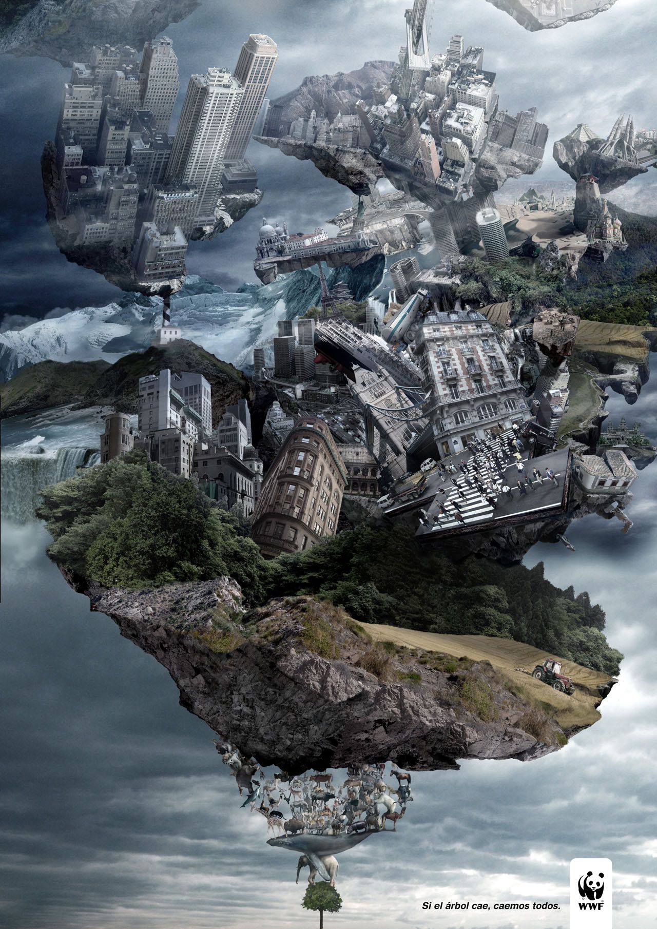
http://adsoftheworld.com/media/print/wwf_tree_2

WWF - If the tree falls, we all fall.
Although it is not necessarily simple in terms of design and aesthetics, the message in which it portrays is a subtle yet powerful one. You are able to see the enormous amounts of detail in full view and how much effort has gone into achieving this design.


http://adsoftheworld.com/media/ambient/frontline_mall

Frontline - Get them off your dog.
This design was featured on the floor of a shopping centre, above ceveral floors where the public can easily see the design in its entirety. From below, the concept may not be easy to distinguish yet the people walking over the design become part of the ad itself - forming the fleas in which Frontline helps get rid of. This is extremely effective and a great example of creative advertising.


NYC Taxi
These posters would be placed on bus shelters throughout New York advertising the benefit (in this case, speed) of taxis in comparison to buses. The design consists solely of the tagline - 'If you hate waiting, raise your hand.' and a cropped image of a New York taxi against a bright orange background (the same colour as the taxis themselves). As people may be in rush or may be wanting to get somewhere in a hurry, this is a quick and easy way to advertise a better alternative.


http://adsoftheworld.com/media/print/abramet_drinking_and_driving_2

Abramet (Campaign against drink driving)
In this ad, they have used a beer can which has been crumpled and discarded to depict a car that has been in a collision. It shows that drink driving has serious consequences. The lighting and atmosphere enhances the dark theme behind the advertisement and the city lights show this could happen anywhere and to anyone.


http://www.ibelieveinadv.com/2009/11/ikea-delivery-service-kitchen-kids-room-living-room/

Ikea
At first glance, this seems like an everyday, modern living room yet you notice a driver towards the top right of the ad. This shows that the set up is in the back of an Ikea delivery truck and promotes what Ikea are now capable of doing - delivering a fully furnished, homely living room to your front door.

What is Graphic Design? Quotes

"Truly elegant design incorporates top-notch functionality into a simple, uncluttered form."


Graphic design is the combination of functionality and form. If there's no function, then what is its use. Conversely, if a design is not aesthetically pleasing, viewers will become dis-interested.

"Graphic Design is simple and effective"

The quote itself is simple and effective. Design shouldn't be over complicated - it should be clear, concise and to-the point.. you don't want an audience to be confused or dismissive of a design.


"Graphic design is a solution to a problem of communication through design"

This quote is self explanatory - graphic design is simply a solution to a client's problem, whether they want a new corporate identiy to appeal towards a new demographic or an advertising campaign which promoted a new product of theirs - they are all things which need to be solved through design.

Sequence examples

We were asked to collect 5 examples of sequences as part of the visual language module. These can range from animation stills to making toast in the morning.


1) Eagle in flight
Amazing sequence photography.
Shows motion of flight through still images merged together.


2) Dot - World's smallest stop motion animation
I recently posted this video but found it fascinating.
Stop motion is a great example of sequencial imagery as each frame is made up of one photograph.
'Dot' is only 9mm tall and is in a set consisting of nuts, bolts, pins and fabrics etc.
Huge amount of detail and careful planning.


3) OK Go - This too shall pass (Music video)
Similar to the famous Honda car advert.
This video begins with the 'domino' effect resulting in subsequent phases and sequences and so on until the song finishes.
The complexity increases as the video goes on with the scale being increased dramatically, from a single domino to a car moving and a piano falling.
Very creative and must have took a long time to plan.


4) Aeroplane safety instructions
A safety card similar to this will be found on all airlines in case of an emergency.
Anyone irrespective of their nationailty are able to understand the process in how they should react by simply looking at the sequence of images.


5) Ikea instructions
Ikea are notorious for including illustrated instructions with their 'do-it-yourself' furniture/items.
The images are detailed, yet informative but require no text.
Monochrome colour on cheap stock reduces cost.
Images are numbered and are easy to follow.

Monday, 4 October 2010

Alphabet Soup Part 2 - Research

As I will be creating a full typeface based on my partners characteristics, interests and hobbies, I first wanted to research into possible design ideas which could influence my own ideas. I have focused on the following words: Academic, precise and neat; therefore I will look for examples of type which are angular, geometric and mathematic.


http://www.typographyserved.com/gallery/Experimental-Typography/606276

I like the use of geometric shapes and intertwining lines and could try to achieve a similar effect in my own development of type. The text seems to flow despite the juxtaposition of sharp and smooth shapes - shattered glass effect becomes an array of bubbles, for example.


http://www.typographyserved.com/gallery/Emirates_-Corp_-Logo-Illustration/655163 

This stylish typeface has an essence of serif typographic styles but is also modern and 'sophisticated' - especially for a logo. The type itself consists of lines and shapes but the majority is block colour (black).


http://www.typographyserved.com/gallery/Polar--Nueva-TipografAa_/521653

I think the way in which some of the letters create block colour where angles are formed (for example, in the letter 'V'). I remember a technique where several lines, joined at different measurements along 2 lines creating an angle, formed a curved shape, similar to this typeface. I will experiment with this and reference during my development.


(Accidently posted on DP blog so added to early DC post)