Sunday 31 October 2010

No News is Good News - Research

Before reading week, we were given a brief which required us to produce a body of research based upon a headline from a newspaper bought on Saturday 23rd October. We needed to choose a headline which would create an interesting and engaging amount of information as it would inevitiably be the basis of our next brief.


After looking at several newspapers, there was one particular article which caught my attention. There have been ongoing news stories about the privacy (or lack of) on Facebook and the restrictions in which Facebook put in place. However, this particular article warned Facebook users of burglary risks due to the amount of personal information posted on the site. I found the following in 'The Daily Telegraph':

The Daily Telepgraph - Page 13

Although information such as your date of birth may seem harmless, if it fell into the wrong hands, it could enable a criminal to commit identity theft or even steal from your own home (as Facebook even allows you to display your address). Many believe this is down to the user and their own common sense but others have complained and believe Facebook are too lenient and should not allow their users to display such information.

As this was an ongoing news story, I could not find similar articles in other newspapers on the same day, apart from one in Daily Star. I found other articles online, however, which are dated throughout this year. 

Daily Star - Page 25


Links to different articles


http://www.telegraph.co.uk/technology/facebook/7915572/Facebook-security-fears-after-private-details-of-100m-users-leaked-to-web.html
http://www.dailymail.co.uk/news/article-1323027/Facebook-holiday-plans-face-insurers-crackdown-posting-details-invites-crooks.html
http://www.guardian.co.uk/technology/2010/may/27/facebook-privacy-settings-red-herring
http://www.bbc.co.uk/news/10117106

Monday 18 October 2010

What is Graphic Design? Web Design

"Truly elegant design incorporates top-notch functionality into a simple, uncluttered form."

Web design defines the aforementioned quote. Web designers need to balance function and form by focusing on the user interface and interaction whilst still maintaining an aesthetically pleasing site. Although the complete opposite to print, there is still guidelines which need to be followed. As websites are usually a source of information, the main aspect is typography. I believe these sites show both form and function and have inspired me even more to design websites in future projects.


http://andasoloarts.deviantart.com/

Although Facebook may not need a re-design, this artist has devised his own vision of how the site should look which I think is far better than the existing layout. The colour scheme is the same yet the way in which colour is used makes the design look contemporary and modern - sleek gradients etc.


http://postmarkapp.com/

This design is clearly set out into 5 main compartments - logo and navigation, image slider and info, how it works, pricing and then 3 main components. This is a simple and concise way of presenting information and makes the user read on for information. The 'sign' up buttons can be clearly identified as the colours are far different to the main colour scheme which immediately draws attention.


http://www.maveronneau.com/

Perfect balance of monochrome and colour. The clear headline against the yellow background acts as the main focal point and introduces the site. It is clean, minimal and has a simple composition which is easy on the eye.


http://www.amazeelabs.com/

I love the organic feel to this design due to the use of toned down colours and textures. The light bulb imagery immediately grabs the users attention.

What is Graphic Design? Advertising

"Graphic Design is simple and effective"


Lego Advertisements

The following lego advertisements are simple, concise but most importantly, nostalgic. An aeroplane, dinosaur, ship and tank can all be represented through simple lego structures - something as complex as a ship can be created using 2 lego blocks showing the versatility of lego and the essence of childhood imagination.


http://speckyboy.com/2009/03/16/39-creative-lego-advertisements-creativty-without-bricks/

HP Printers

These ads promote the high quality and realistic finish of HP prints. The photos are so realistic infact, that they almost seem 3D. It requires little text as the imagery speaks for itself; they have simply added the HP logo and 'High quality printing'. From looking at this and then seeing the image as a whole, you can immediately tell what the concept is.


http://adsoftheworld.com/media/print/hp_printers_pony
http://adsoftheworld.com/media/print/hp_printers_baby


Fizz

Although I am not as fond on hand-rendered outcomes as opposed to digital outcomes, I really like the use of typography in the following advertisements. The illustrations compliment the mass amounts of text yet the concept (even the brand itself) is hard to distinguish.


http://www.ibelieveinadv.com/index.php?s=fizz


Saturday 9 October 2010

What is Graphic Design? Typographic art

Typographic Art

Although type is the main focus in the following designs, the artists/designers have intertwined and manipulated images into and around the letterforms. I love this style of work and believe it further enhances the word/message it is trying to convey. I want to experiment with similar processes and techniques for my current brief - Alphabet Soup.


http://chin2off.deviantart.com/gallery/

Amazing example of imagery manipulated type. The word 'breakfast' is formed from egg shells, yolk and bird feathers. The final outcome is brilliant and the word is clear and legible. The colours, although fairly limited, enhances the design and reflects the word brilliantly.


http://chubbaart.deviantart.com/

Colours can evoke all sorts of messages. In this example, the artist has taken a more positive approach; the colours are bright, fun and vivid. The text itself is made up of a variety of geometric shapes of different colours but don't seem to make the type too busy.


http://biomachina.deviantart.com/

Although the letters may be hard to distinguish at first glance (GET WET),  it is still an aeshetically pleasing design. The artist has focused more on the illustration aspect by trying to combine this effectively with type. The way in which the letterforms are set makes your eyes scan the entire canvas .


http://jaxenl.deviantart.com/

This is one of my favourite examples of illustrative type as although the letterforms are clear and legible, the designer has seamlessly merged other imagery without detracting any attention from the text itself. It was to mark the end of the year 2009 which is highlighted in the text, 'blowing in the wind. 2009'.


http://chin2off.deviantart.com/gallery/

Both of these pieces (above and below) are similar in terms of techniques and processes to the first image in this post (breakfast). The letters explode enabling us to see what is underneath the text. Wrath is portrayed through the lava/magma underneath the dark rock/stone.


http://he1z.deviantart.com/


http://biomachina.deviantart.com/

What is Graphic Design? Anamorphic Design

anamorphism - anamorphosis: a distorted projection or perspective; especially an image distorted in such a way that it becomes visible only when viewed in a special manner

Anamorphic illusions are images that can only be truly appreciated from a certain vantage point. For my final major project of my National Diploma course, I experimented with anamorphic design as I thought it was extremely creative. Although it may seem simple, it is far more complex and is difficult to achieve a flawless outcome. A simple example would be road signs informing car users to 'SLOW' etc as the letters are stretched in height allowing people to read the text from far away. These are more examples which explore anamorphic type and image:


http://www.typographyserved.com/Gallery/Anamorphic_Helvetica/330746


http://designtaxi.com/news/32655/Anamorphic-Typography-Plays-with-Architecture/


Julian Beever is an English chalk artist who creates trompe l'oleil (anamorphic) designs on pavement surfaces. This is just some of his amazing work:


http://www.boredpanda.com/44-amazing-3d-sidewalk-chalk-artworks-by-julian-beever/

What is Graphic Design? Abstract Manipulations

Minimalist Photo-manipulations

One of the quotes I selected revolved around simplicity and minimalism. These photo manipulations define these two words - not necessarily in terms of design itself but the colours, shapes and images used.


Minimalist colour scheme (monochrome with the addition of yellow) works well. The lines either side of the piece draw your eyes to the main focal point in the centre therefore the placement is effective. However, it does not evoke a specific message, in my opinion, and is probably a self-initiated experimentation.


http://biomachina.deviantart.com/

I like the use of geometric shapes and shatter effects to create a 'burst' of imagery. Similar to the previous design, a minimalist colour scheme has been used as to not detract from the complexity of the shapes. The subtle addition of pink really enhances the design as it breaks up the already existing monochrome colour scheme.


The juxtaposition of fluid and soft imagery against sharp and geometric shapes is extremely effective. Again, I believe the limited colour scheme enhances the design.


http://voze.deviantart.com/

I can imagine this piece being used as a CD cover or poster. The spontaneous splatters and brush strokes strewn across the page breaks up the sharp lines of the triangles and is a great example of manipulating imagery - photographic, hand-rendered and digital.


http://naziito.deviantart.com/

The bright colours immediately engage with the viewer as they are vibrant and have impact against the black number 7. This is considered a lucky number which is possible the reason for the bright colour scheme - uplifiting, optimistic etc.


http://freshisrael.deviantart.com/

Out of all these examples, this is probably my favourite. It uses an effective balance of tone and contrast and although the colours are neutral and understated, the piece in itself is high impact and therefore immediately grabs your attention.

What is Graphic Design? Ikea Cookbook

"Graphic Design is simple and effective"


Homemade is best - Cooking book without instructions
(Designed for Ikea)

"We wanted to ensure a connection between IKEA's kitchen appliances and one of the best things you can do in a kitchen, some great baking. So the main attraction in the campaign became a 140 page coffee-table baking book presented in a very visually unique and spectacular way."

Although the book may not serve any purpose due to the lack of text, it is a fantastic way of displaying recipes. The recipes are presented as graphic still-life portraits on a warm and colourful backdrop. Their inspiration came from high fashion and Japanese minimalism and this is certainly evident in the following images.


http://trendland.net/2010/09/25/homemade-is-best-by-evelina-bratell/
http://www.carlkleiner.com/

Tuesday 5 October 2010

What is Graphic Design? Creative Advertising

"Graphic design is a solution to a problem of communication through design"


Creative advertising is one of my favourite forms of design. Advertising is all around us, from billboards and large scale designs to flyers and business cards. I believe the simplest form of advertising is the most inspiring - the hidden messages and ones which make you think. These are some examples:


http://www.eatmedaily.com/2009/11/mcdonalds-french-fry-wi-fi-ad/
McDonalds - Free wi-fi
The use of existing products to form a wi-fi symbol advertises both the products and the free wi-fi. The corporate design is consistent through the use of yellow and red which is reflected in the logo. Simplicity is key in this design and that is what McDonalds wanted to convey.

The following ad also advertises McDonalds free wi-fi in a different way. In this design, they have depicted a burger box as a laptop, indicating that wi-fi is available in their stores.


http://adsoftheworld.com/media/print/mcdonalds_wifi?size=_original


http://adsoftheworld.com/media/print/samsung_power

Samsung F400 - Knock out speakers
To convey the power of their speakers, they manipulated a pair of earphones into boxing gloves. This connotes a sense of quality and power. The contrast between the black boxing gloves and the light grey background creates impact. I like the subtle editing of the tagline towards the bottom of the poster as they have slowly increased the size of the lettering which is of a similar aesthetic to sound waves coming out from a speaker.


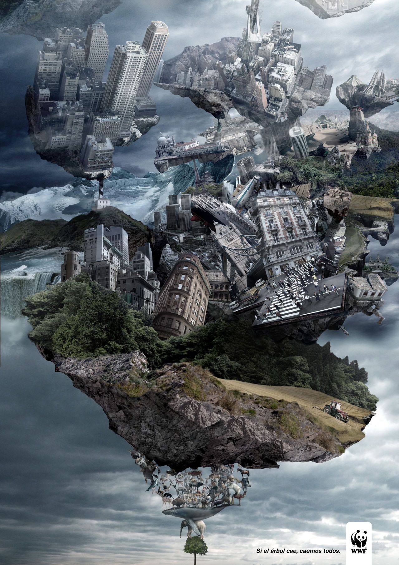
http://adsoftheworld.com/media/print/wwf_tree_2

WWF - If the tree falls, we all fall.
Although it is not necessarily simple in terms of design and aesthetics, the message in which it portrays is a subtle yet powerful one. You are able to see the enormous amounts of detail in full view and how much effort has gone into achieving this design.


http://adsoftheworld.com/media/ambient/frontline_mall

Frontline - Get them off your dog.
This design was featured on the floor of a shopping centre, above ceveral floors where the public can easily see the design in its entirety. From below, the concept may not be easy to distinguish yet the people walking over the design become part of the ad itself - forming the fleas in which Frontline helps get rid of. This is extremely effective and a great example of creative advertising.


NYC Taxi
These posters would be placed on bus shelters throughout New York advertising the benefit (in this case, speed) of taxis in comparison to buses. The design consists solely of the tagline - 'If you hate waiting, raise your hand.' and a cropped image of a New York taxi against a bright orange background (the same colour as the taxis themselves). As people may be in rush or may be wanting to get somewhere in a hurry, this is a quick and easy way to advertise a better alternative.


http://adsoftheworld.com/media/print/abramet_drinking_and_driving_2

Abramet (Campaign against drink driving)
In this ad, they have used a beer can which has been crumpled and discarded to depict a car that has been in a collision. It shows that drink driving has serious consequences. The lighting and atmosphere enhances the dark theme behind the advertisement and the city lights show this could happen anywhere and to anyone.


http://www.ibelieveinadv.com/2009/11/ikea-delivery-service-kitchen-kids-room-living-room/

Ikea
At first glance, this seems like an everyday, modern living room yet you notice a driver towards the top right of the ad. This shows that the set up is in the back of an Ikea delivery truck and promotes what Ikea are now capable of doing - delivering a fully furnished, homely living room to your front door.