Saturday, 29 October 2011

Good is...? Plutchik's wheel of emotion

Robert Plutchik was professor emeritus at the Albert Einstein College of Medicine and adjunct professor at the University of South Florida. He considered there to be eight primary emotions - anger, fear, sadness, disgust, surprise, anticipation, trust, and joy.

He created a wheel of emotions in 1980 which consisted of 8 basic emotions and 8 advanced emotions each composed of 2 basic ones. His model makes connections between the idea of an emotion circle and a color wheel. Like colors, primary emotions can be expressed at different intensities and can mix with one another to form different emotions.


Good is...? Points of research

During the tutorial with Lorenzo, it was noted that even with a defined concept such as nostalgia and the five senses, there are many points of research which I could look into in more depth.

  • Emotions (in general)
  • How we process emotions
  • The 5 senses
  • Medicine (and its packaging)
  • Childhood films/tv programmes
  • Childhood toys, technology, gadgets
  • 80s/90s music

Good is...? Nostalgia pack inspiration

This complex medicine first aid kit uses various drawers, segments, pull outs etc to package various items. Green and white are most commonly associated with health and first aid and the cleanliness, use of negative space and minimal composition references this. The pack opens via two drawers either side, splitting the first aid "+" symbol in half, revealing several compartments.

Source: courtesy of Steph, cheers.


Friday, 21 October 2011

Good is...? The 5 Senses

Definition

A faculty by which the body perceives an external stimulus; one of the faculties of sight, smell, hearing, taste, and touch.

The 5 (?) senses

Human beings have a multitude of senses. In addition to the traditionally recognized five senses of sight (ophthalmoception), hearing (audioception), taste (gustaoception), smell (olfacoception or olfacception), and touch (tactioception), other senses include temperature (thermoception), kinesthetic sense (proprioception), pain (nociception), balance (equilibrioception) and acceleration (kinesthesioception). What constitutes a sense is a matter of some debate, leading to difficulties in defining what exactly a sense is.


Sight

Sight or vision is the ability of the eye(s) to focus and detect images of visible light on photoreceptors in the retina of each eye that generates electrical nerve impulses for varying colors, hues, and brightness.

There are two types of photoreceptors: rods and cones. Rods are very sensitive to light, but do not distinguish colors. Cones distinguish colors, but are less sensitive to dim light. There is some disagreement as to whether this constitutes one, two or three senses. Neuroanatomists generally regard it as two senses, given that different receptors are responsible for the perception of color and brightness.

Some argue that stereopsis, the perception of depth using both eyes, also constitutes a sense, but it is generally regarded as a cognitive (that is, post-sensory) function of the visual cortex of the brain where patterns and objects in images are recognized and interpreted based on previously learned information, This is called visual memory. The inability to see is called blindness.

Hearing

Hearing or audition is the sense of sound perception. Hearing is all about vibration. Mechanoreceptors turn motion into electrical nerve pulses, which are located in the inner ear. Since sound is vibrations propagating through a medium such as air, the detection of these vibrations, that is the sense of the hearing, is a mechanical sense because these vibrations are mechanically conducted from the eardrum through a series of tiny bones to hair-like fibers in the inner ear, which detect mechanical motion of the fibers within a range of about 20 to 20,000 hertz, with substantial variation between individuals.

Taste

Taste (or, the more formal term, gustation) is one of the traditional five senses. It refers to the ability to detect the flavor of substances such as food, certain minerals, and poisons, etc. Humans receive tastes through sensory organs called taste buds, or gustatory calyculi, concentrated on the upper surface of the tongue.

The sensation of taste can be categorized into five basic tastes: sweetness, bitterness, sourness, saltiness, and umami. The recognition and awareness of umami is a relatively recent development in Western cuisine. MSG produces a strong umami taste.

Smell

Smell or olfaction is the other "chemical" sense. Unlike taste, there are hundreds of olfactory receptors (388 according to one source), each binding to a particular molecular feature. Odor molecules possess a variety of features and, thus, excite specific receptors more or less strongly. This combination of excitatory signals from different receptors makes up what we perceive as the molecule's smell.

In the brain, olfaction is processed by the olfactory system. Olfactory receptor neurons in the nose differ from most other neurons in that they die and regenerate on a regular basis. The inability to smell is called anosmia. Some neurons in the nose are specialized to detect pheromones.

Touch

Touch, also called tactition or mechanoreception, is a perception resulting from activation of neural receptors, generally in the skin including hair follicles, but also in the tongue, throat, and mucosa. A variety of pressure receptors respond to variations in pressure (firm, brushing, sustained, etc.).

 The touch sense of itching caused by insect bites or allergies involves special itch-specific neurons in the skin and spinal cord. The loss or impairment of the ability to feel anything touched is called tactile anesthesia. Paresthesia is a sensation of tingling, pricking, or numbness of the skin that may result from nerve damage and may be permanent or temporary.

Thursday, 20 October 2011

Good is...? "My earliest memory..."

Insightful blog where people can submitted their earliest memory; full of nostalgia.

myearliestmemory.tumblr.com

Good is...? Packaging inspiration

In reference to today's studio workshop (here), I decided to look at existing packaging designs in relation to the 'nostalgia pack' design idea I devised.

Higgins India Ink

This hand-crafted wooden box with black and white labels was designed by Alex Sophocles. The traditional aesthetic of the box itself and the bottles used for the ink compliment the gothic type of the logo, whilst still retaining a sleek and concise approach to the design as a whole. The contents are cushioned therefore there is no need for individual segments to hold each item.

Source: designworklife.com


AWPIAMO

"A white page is a missed opportunity". Creation of a book questioning the responsibility and commitment of the graphic designer.

Source: saywhat-studio.com


LG Design Studio

This book showcases the work of LG Design Studio over the past 2 years and due to its confidentiality (of only being handed out to the senior members of the team) the designers developed and styled the book using the concept of a secret dossier with subtle technical details throughout. To convey the secrecy and exclusivity of the work each book was delivered in individually number-stamped envelopes.


Wednesday, 19 October 2011

Team Impression - Process is Form

At the end of the print visit with Team, they gave us each a book entitled 'Process is Form'.

This book by Team impression, has been produced to encourage readers to analyse and consider more closely the relationship between the process and mechanics of print production and the practice of design and visual communication. The book is illustrated throughout with combinations of special colours and print techniques along with photographs of industrial objects liberated from their everyday habit.

The hexagonal illustrations are a combination of 1-4 colours, spot UV varnishes and foils. Certain elements of print production such as guillotine blades and wash-up bottles are photographed on plinths to show how print is an art form in itself.


Good is...? Logo case study

Lorraine e-mailed out some thought-provoking logo case-studies from various companies. The following, by Danzk, is particular insightful.

Danzk

DANZK is an upcoming blog that seeks to explore the lifestyle aspect of Denmark, including culture, food, art and design. It intends to educate the Danish customs to locals a well as tourists from abroad.

Pete Lacey aka 'Chopeh' was the designer who was sought to devise their logo. He states the brief was simple; "Create a stylish and modern identity that had a relationship to Danish design, but one that didn’t use clichĂ© elements."

Process

He wanted to make sure there was a subtle connection between the logo and Denmark therefore he began by looking at Danish design and in particular, furniture. The simplicity and functionalism of these designs became the start point to his logo design process.


Using these two key words, he decided to break the word DANZK down into its most functional and simple parts. Using minimal sketches with little refinement, he started to generate various design ideas.


Using grid paper, he was able to incorporate some sort of structure to a chosen design concept, making the lines more accurate etc. He states this a long process as it usually requires a lot of refinement and tweaking before getting near towards the final outcome.


Once he settled on a final design, he started to focus on the letterforms in more depth and started to form the logotype. He states, "I wasn’t particularly happy with the right-hand cap of the N and the left-hand cap of the Z sitting so close together. Technically they were correct, but I didn’t like the repetition. I set about working on a way to bring the N & Z together neatly."


During the digital stage, he says "I find it helpful to look at the semi-final logo on different media. I print it off, look at it at the standard ‘web’ size logo and I even send it to my iPhone. This way I get to look at the logo at different sizes, light conditions and distances. It really helps you get a feel for the logo, to make sure that the rhythmn is right. It’s also worth at this stage to get some critque from other professionals."


After a few small adjustments, he has his final logotype.


Monday, 17 October 2011

What is design for print? Proofing & Preflight

Preflight

The term preflight check originates from the aviation industry where it is a standard procedure for pilots to go over a checklist before lift-off. Preflight checks (preflighting) for print documents have a similar idea in mind. They run trough all the files you used in the document to see if they're missing, changed or anything else that might have happened to the file.

Back in the day, preflight programs or plug-ins gathered all used fonts before sending off your document to the printer. With the rise of PDF this process changed as fonts are included fully or in part in the PDF file. A (modern) preflight check checks all used images and fonts in the file, if the files can be found at their indicated locations, if they're in CMYK and if fonts are used and load correct. On occasion copyrighted fonts cause problems with being embedded in the PDF file. This also is checked in the preflight check.

InDesign

Click File > Preflight… in the menu to open the Preflight Check dialog screen. Here you'll find categorized sections to check your documents on errors and missing files.  A small warning icon  indicates problem areas.


If there are any files missing you can replace those from the Preflight Check dialog screen. If - for any reason - you can't send a packaged PDF to your printer, there's also the option to package all external files in one directory to send those separately with your layout document.


However, there are some general proofing issues which preflight does not cover. These include:
  • Is the bleed correct? Does the size comply with the printers request. 
  • Are your color separations correct? No PMS colors mixing with your CMYK or the other way around. 
  • Are you exporting with the correct registration marks? Check if image resolutions are good enough (300 dpi for standard print work) 
  • Is the size of the document correct? Are you adding the bleed size to the document size?

What is design for print? Multi-tone

Multi-tone

Duotone is the generic name for multitone printing, which can be done with two, three or four inks. This process requires that the press be set up with special inks, usually PANTONE-designated colors, instead of the standard CMYK inks used for process color printing. Usually the images are printed with a dark base color and a lighter second color, overprinted to fill in, tint and tone the photo or graphic.

Duotone color mode in Photoshop supports between one to four colors of ink. Because home inkjet printers are far better at printing full-color images than black and white, many photographers and designers use Photoshop Duotone processing to improve their artwork/prints. Photoshop's Duotone mode is also commonly used for creating sepia toned prints, using black and yellow inks, sometimes with a third colour.

There are 4 types of multitone images in all. Each one contains the number of inks as the name implies:

  • Monotone grayscale images printed with a single ink 
  • Duotone grayscale images printed with two inks 
  • Tritone grayscale images printed with three inks 
  • Quadtone grayscale images printed with four ink


(Images below are from the Photoshop induction)


What is design for print? Printing processes

(Offset) lithgography

It is the most widely used printing technique on the market, suitable for printing on paper, cardboard, plastic and other flat materials. Offset is used for printing books, newspaper, stationery, packaging, etc. The following video (provided by Lorenzo) explains the offset process in more depth which I have summarised below:


In addition to size, page count, colour coverage and quantity the estimator also evaluates press time, special paper order, labour and shipping costs. This must be done efficiently to get the best price. Each file is inspected carefully to make sure they have all the fonts, colour palettes and high resolution graphics - a sample is then given to the client

The colours are then separated into the four colour process colours or PMS (Pantone) colours. Each colour is then etched into thin, aluminium plates which are then taken to the press to print the job.

The press is comprised of four separate presses, one in each tower. The four plates are then wrapped around a plate cylinder in each of these 'towers'.

There needs to be the right balance of ink and water to keep the non image area, clean. The image is transferred as a reverse image from the plate to a blanket (rubber pad) which is locked tightly around the blanket cylinder. The paper is moved from unit to unit to create the full composite image. The impression cylinder squeezes the paper at just the right pressure to make sure the print is as smooth as possible.


Flexography

In flexography a flexible (typically rubber) printing plate is used, which extends the range of substrates that can be printed on. A positive, mirror image rubber polymer plate on a cylinder, transfers 'sticky ink' directly onto the print surface. It can be used for printing on almost any type of substrate including plastic, cellophane and paper. Examples of products are crisp packets and bottle labels.

  1. Ink Roller The Ink Roller transfers the ink that is located in the ink pan to the second roller, which is the Anilox Roller. 
  2. Anilox Roller This is what makes Flexography unique. The Anilox Roller meters the predetermined ink that is transferred for uniform thickness. It has engraved cells that carry a certain capacity of inks that can only be seen with a microscope. 
  3. Plate Cylinder The Plate Cylinder holds the printing plate, which is soft flexible rubber. Sticky 2-way tape is used to mount the plate to the Plate Cylinder. 
  4. Impression Cylinder The Impression Cylinder applies pressure to the Plate Cylinder, where the image is transferred to the substrate.


Benefits of Flexography printing
  • Better resolution and ability to print four color process (or more). 
  • Increased ability to reproduce highlight tonal values. 
  • Uses a wider range of inks, and can print on  a variety of different materials. 
  • Inks have low viscosity to enable faster drying
  • Faster production and lower costs.


Digital print

(definition courtesy of wikipedia) Digital printing refers to methods of printing from a digital based image directly to a variety of media. It usually refers to professional printing where small run jobs from desktop publishing and other digital sources are printed using large format and/or high volume laser or inkjet printers.

Digital printing has a higher cost per page than more traditional offset printing methods but this price is usually offset by the cost saving in avoiding all the technical steps in between needed to make printing plates. It also allows for on demand printing, short turn around, and even a modification of the image (variable data) with each impression. The savings in labor and ever increasing capability of digital presses means digital printing is reaching a point where it will match or supersede offset printing technology's ability to produce larger print runs at a low price


Rotogravure

Gravure is a type of the intaglio printing process that involves engraving the image onto an image carrier. Gravure printing presses two large print reels of paper together rather than sheets of paper. This type of printing is the fastest and widest printing press in operation. It is capable of transferring more ink to the paper than other printing processes, and is also noted for its remarkable density range.
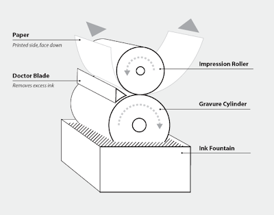


A gravure printing press has one designated printing unit for each color, commonly CMYK. While the press is in operation, the engraved cylinder is partially immersed into the ink fountain, filling the recessed cells. As the cylinder rotates, it draws ink out of the fountain with it. Acting as  a squeegee, the doctor blade scrapes the cylinder before it makes contact with the paper removing ink from the non-printing (non-recessed) areas. Next, the paper gets sandwiched between the impression roller and the gravure cylinder. This is where the ink gets transferred from the recessed cells to the paper.

The purpose of the impression roller is to apply force,  by pressing the paper onto the gravure cylinder, ensuring maximum coverage of ink. Then the paper goes through a dryer because it must be completely dry before going through the next color unit and absorbing another  coat of ink.


Screen print

Screen printing is a printing technique that uses a woven mesh to support an ink-blocking stencil. The attached stencil forms open areas of mesh that transfer ink or other printable materials which can be pressed through the mesh as a sharp-edged image onto a substrate. A roller or squeegee is moved across the screen stencil, forcing or pumping ink past the threads of the woven mesh in the open areas.

Screen printing is also a stencil method of print making in which a design is imposed on a screen of silk or other fine mesh, with blank areas coated with an impermeable substance, and ink is forced through the mesh onto the printing surface. It is also known as silkscreen, serigraphy, and serigraph printing.


Screenprinting is more versatile than traditional printing techniques. The surface does not have to be printed under pressure, unlike etching or lithography, and it does not have to be planar. Different inks can be used to work with a variety of materials, such as textiles, ceramics, wood, paper, glass, metal, and plastic. As a result, screenprinting is used in many different industries, including: 

  • Balloons 
  • Clothing 
  • Decals 
  • Medical devices 
  • Printed electronics, including circuit board printing 
  • Product labels 
  • Signs and displays 
  • Snowboard graphics 
  • Textile fabric 
  • Thick film technology
  • ... and so on


CMYK printing (screen angles)

To improve print quality and reduce moiré patterns, the screen for each color is set at a different angle. While the angles depend on how many colors are used and the preference of the press operator, typical CMYK process printing uses any of the following screen angles (in degrees)

C: 15, 15, 105
M: 74, 45, 75
Y: 0, 0, 90
K: 45, 75, 15


What is design for print? GF Smith

GFSmith is an independent British company that has been providing the creative world with inspiration for over a century. They are a company who specialise in paper and cover a diverse range of colours, weights, sizes, formats and finishes. Their downloadable resources will be useful in showcasing how vast the possible choice of stocks is.

"Our distinctive coloured and textured papers are widely regarded as the definitive collection of premium materials for design and print. We believe this distinction has come from our long-standing ties with world-renowned mills; our innovation in sources, materials and techniques; and an ingrained sense of pride in our products."

A significant proportion of GFSmith papers are guaranteed for digital printing. Many of their coloured, textured, metallic, FSC accredited and recycled papers are approved for HP Indigo, Xerox iGen, Kodak Nexpress, Colour Laser and Inkjet technologies.


Stationery

Many papers from their ranges are ideal for stationery use, and a certain number have been specifically engineered with that function in mind. They all feature ideal weights for letterheads and business cards, and matching envelopes are available in both standard and


Coloured paper (Colourplan)

Colorplan is a classic collection of coloured papers and boards available in 56colours, 8 weights and 25 embossings. Available with matching envelopes, cut sizesand a unique duplexing service for 540 and 700gsm finished weight in the same or contrasting colours. Envelopes are available in all shades of Colorplan, C6, DL, window and bespoke sizes.


Colorplan is the cornerstone of the GFSmith portfolio. This iconic range of premium coloured papers and boards is generally considered to be indispensable within the design industry.  Choose from a broad palette of 50 colours, 8 weights and 25 embossed textures.  We should also highlight the fact that Colorplan is guaranteed for digital printing and has FSC accreditation.

(click for larger preview)


Colorplan

Housed in a Pale Grey one-piece Clamshell box, six books guide the user through the paper selection process.  

Select Colour - The entire collection of colour stocks shown as chips by colour and shade, with accompanying stock charts broken up by pages of photography.  

Select Black+White - All black, white and every monochrome shade in-between shown as chips, with accompanying stock charts.  

1 Colorplan/2 Smooths/3 Textures/4 Specials - Individual books showing every colour and weight as a large swatch, grouped by paper/brand type and interleaved with Factory Yellow spec pages that double as section dividers.